CSS viewport units ·
100vh on phones: start with svh, use dvh with care
Mobile browsers size 100vh as if the bars were hidden. How svh, lvh and dvh differ, why svh is a safe default, and where dvh helps.
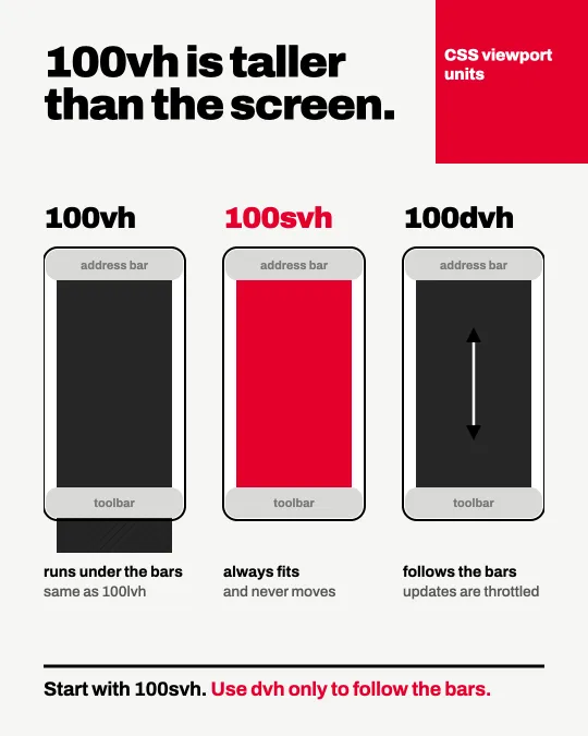
On a phone, height: 100vh is taller than the screen you can see. Mobile browsers size vh as if the address bar and toolbar were hidden, so a full-screen hero runs under them. The web.dev article on viewport units puts it plainly: elements sized to be 100vh tall bleed out of the viewport.
Three units, three assumptions
svh is the small viewport: the browser interface is assumed expanded. lvh is the large viewport: it is assumed retracted. dvh is the dynamic viewport and follows the bars as they slide in and out, clamped between the two. They are supported since Chrome 108, Edge 108, Firefox 101 and Safari 15.4.
Which one to start with
I start with 100svh. It always fits and never moves. dvh resizes while you scroll, and web.dev notes that the values do not update at 60fps and that updating is throttled as the browser interface expands or retracts. Use it when the layout really has to follow the bars.
.hero {
  min-height: 100svh;
}
Sources
I post short notes like this on LinkedIn.