Chrome DevTools 153 ·
Chrome DevTools Device Mode now groups devices, foldables included
Since Chrome 153, Device Mode groups presets into Mobile, Foldables, Tablets & Desktops and Smart Displays. What changed and how to test a foldable.
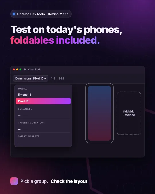
Chrome DevTools has a cleaner device list in Device Mode. Since Chrome 153, stable since 8 September, the Dimensions menu groups the emulated devices into Mobile, Foldables, Tablets & Desktops and Smart Displays. The October 2026 New in DevTools post calls it modernized presets grouped by form factor, with outdated legacy devices retired.
What's in the list now
Out of the box, Mobile shows iPhone SE, iPhone 16, iPhone 16 Pro Max, Pixel 9, Pixel 9 Pro, Pixel 10 and Samsung Galaxy A55. Foldables has Pixel 9 Pro Fold and Galaxy Z Fold 6. Tablets & Desktops has iPad Mini, iPad Pro 13 and Surface Pro 10, and Smart Displays has Nest Hub Max.
Not every older preset is gone. Phones like iPhone XR, iPhone 14 and Pixel 8 are still there but hidden by default; you switch them back on under Settings > Devices. The really old ones, such as iPhone 6/7/8, Pixel 2 and the Nexus phones, were removed. iPhone 16 and Pixel 10 themselves arrived earlier, in Chrome 151. What 153 changed is the grouping and which devices you see first.
Testing a foldable
Open DevTools, click Toggle device toolbar (Command+Shift+M on a Mac, Control+Shift+M on Windows and Linux) and pick a device from the Dimensions list. For a foldable, the toolbar adds a Device posture menu with Continuous and Folded. In the Chrome 153 device list, Galaxy Z Fold 6 is 412 × 968 in Continuous, and Folded switches to its 744 × 860 inner screen with the fold marked down the middle.
That inner screen is worth a look in any Angular app with breakpoints. At 744 pixels it is just under the 768 that many layouts use as their tablet breakpoint, so it usually gets the phone layout on an almost square screen. Whether that looks right is quick to check here before anyone files a bug from a real device.
Still an approximation
The Device Mode docs call it a first-order approximation: your code doesn't run on a phone, and DevTools can't simulate things like a mobile CPU. I use it to catch layout problems early, and I check anything performance-sensitive on a real device with remote debugging.
Sources
- New in DevTools, October 2026 (Chrome 153 and 154)
- Simulate mobile devices with Device Mode
- EmulatedDevices.ts in Chrome 153 (DevTools source)
I post short notes like this on LinkedIn.